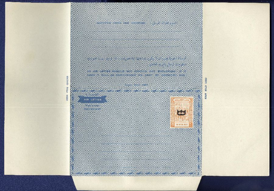
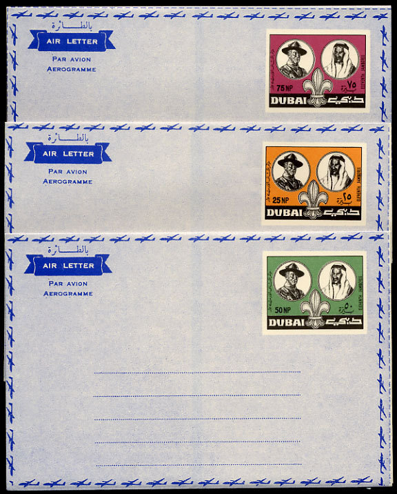
Aerogrammes
CREATED ITEMS NEVER ISSUED
The following items were never issued by the Government of Dubai. They were created by the Dubai Philatelic Agency and sold "under the counter" to unsuspecting collectors and dealers.
The items consist of two different types: Outright fraudulent items and: Reprints that were not officially sanctioned by the government. These were created for the sole purpose of making profit for those involved, without the government's knowledge. Contrary to what some people say, these were not trials nor proofs that were rejected by the government.
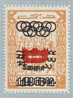
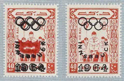
The Olympic overprint was found with the red shield and black rings on five of the stamps of the Scout set. The black sheld with red rings was always considered of doubtful status and Mr. Mosden would state they were officially issued and Mr. Stephan would state they were not. The evidence points to them not being oficially issued and having been done as a "favor printing" for someone - most likely a dealer. The overprints were never oficially issued on the aerogrammes, even though many varieties exist.
The aerogrammes were printed on a cream colored paper and overprinted with a background in blue. The stamp images, which included the values, were printed in several colors and placed in a white rectangle that was left for them. Later, some of these stamp images were overprinted in combinations of two colors.
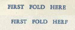
Many of these created items exist with a very noticible "FIRST FOLD HERE" instruction in the white margin. Later, due to the popularity of the subject matter, the images were redesigned with very slight image differences and the instruction often read, "FIRST FOLD HERF". If one compares the fonts of these two lines it is apparant that there are differences. Also, the last letter of "HERE", now appears as an "F". Some of them look as if it was a broken "E", while others appears to be an "F". The font is most likely a broken "E" as one finds copies with the bottom portion of the letter thin and weak in appearance. These must be copies before the bottom broke off on the font.
When questioned about the differences in the designs and printing, Mr. Mosden laughed and said they made so many of them that they stopped putting gum on the flaps of the aerogrammes. Thus these "errors" exist with gum and without gum.
Several dealers had expressed anger at the fact that they were contacted by Mr. Mosden and told they could buy the entire remaining stock of the aerogrammes and the "errors". Several did, only to find that later they were still being ofered in large lots to others. The excuse they were given was that they discovered the remaining ones in their stock, not knowing they were there.
Some spectacularly appearing "errors" that were created have been offered on the market for as much as $1000 each. Needless-to-say, they are certainly not worth it.
There is an unresolved problem regarding the 20np stamp image. Of the issued set of three aerogrammes, it is the only value that the font for the "2" does not match the other two aerogrammes. One was designed but not used when the set was first issued. Thousands were printed and are common with what I consider the broken "E" variety, making it look like an "F". The fact that the bottom arm of the "E" eventually broke off during the printing process, has no bearing on the design being changed for this value. The broken "E" is found on all printings and all values.
THE OLYMPIC OVERPRINTS
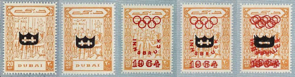
This is what was most likely to be the issued image, but was not used. The instructions have "HERF", rather than "HERE". It is strange that the shape of the number "2" matches the 30np and 40np values, but was not used. A differently shaped "2" was used and can be seen below with the black overprints.
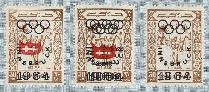
These three stamps are all reprints and they have "HERF" in the instructions. Notice that there is no grass to the left of the words "AIR MAIL" at the bottom of the image. See the black overprints below for a comparison.
Both of these are reprints and have "HERF" in the instructions. The words "AIR MAIL" appears to be slightly crooked and there is a wider space between the boys shoulder on the left side from the frame. Check the images in the black overprint to see the differences.
The image on the left is the issued printing and has "HERE" in the instructions. The second from the left image has "HERF" in the instructions and the "2" that matches the other aerogrammes in the set. The two images on the right each have "HERE", but the bottom arem of the "E" is thin and week. It is my assumtpion that it eventually broke off during the printing process.
Note the differences in the first image on the left, from those to it's right. The font for the "2" is different from the others. There are also differences in the images of the scouts. The image on the left has an extra spear along the left margin and the other spears under the words "AIR MAIL" are taller. There are also other differences. For some reason, even though the font for the "2" is different from the other two values of this set of three aerogrammes, this was the original issued design. Those to the right were the reprint and have the "FIRST FOLD HERF" in the margin.
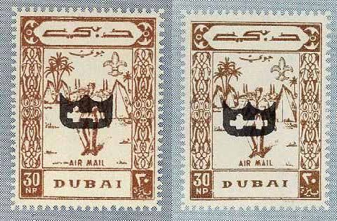
The image on the left was the issued image and the word "HERE". The one on the right differs in that the grass on the left, and above it, are missing next to the words "AIR MAIL" at the bottom of the image. This aerogramme has "HERF" in the instructions.
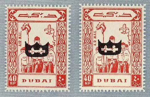
Both of these overprints are on the issued design and they both have "HERE" in the instructions. A comparison of the vertical words "AIR MAIL" will show that the reprint was not perfectly vertical. Also, the space between the shoulder of the scout at the bottom left, and the frame, is wider in the reprint.
Recently Created Itesm for the Philatelic Market
- Completely bogus aerogrammes recently created in Lebanon.